#polygonal style
Explore tagged Tumblr posts
Text


CG: THERE ARE... PARALLELS TO OUR PASTS. CG: WE DON'T REALLY LIKE TO TALK ABOUT IT. CG: BUT IT'S NICE HAVING SOMEONE WHO SORT OF GETS IT.
for @davekatweek day 6 a bit of angst about their upbringings
should have picked a different style for this im not exactly happy with it but ehhh theres always redraws
completed sept 20 2024
#davekatweek#davekatweek2024#davekat#dave strider#karkat vantas#homestuck#my art#digital art#polygonal style#lineless style#well. ''lineless''#harper highlights
95 notes
·
View notes
Text

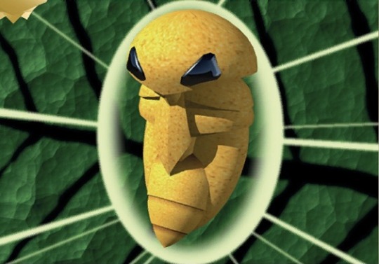

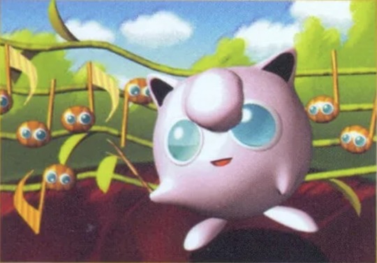

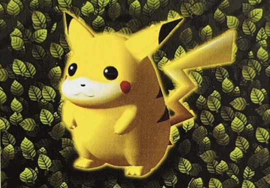


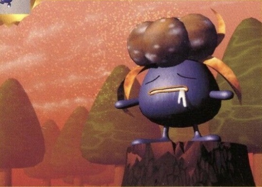
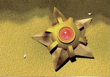
Pokémon Card Art by Keiji Kinebuchi
#Pokémon#Pokémon cards#1998#pokemon#Pokémon tcg#tcg#ditto#kakuna#polygon#jigglypuff#starmie#digglet#pikachu#staru#gloom#y2k#2000s#2000s nostalgia#2000s kids#2000s style#y2k nostalgia#00s#y2k aesthetic#y2k style#2000s kid#1999#90s#1990s#Keiji Kinebuchi#00s kid
10K notes
·
View notes
Text


Pre-nibelheim Sephiroth holding low poly Seph
No talk me I'm angy
#i may have made him too babygirl i fear#Sephiroth is not immune to cute things#this idea wouldn't leave me alone#i may do a continuation and draw him with other low polygon FF7 characters#if y'all are interested in seeing that lemme know#final fantasy 7#final fantasy vii#ff7#Sephiroth#sephcanons#low polygon sephiroth#low poly Sephiroth#nothing about my art style is consistent#original ff7#ff7 remake
356 notes
·
View notes
Text

Monster hunter inspired icons for some of my guys B)
#this isnt specifically meant to imitate the mh style 1 to 1 but its the way I like to draw it/interpret it heehee#windyart#in order of appearance#c#dima#alex#adriel#cercerion#orion#I wanna do some more ocs but these are the ones I had ideas and energy for atm >:)#polygonal#legally they are haha#mh icons
757 notes
·
View notes
Text

DANBERT 1997 GAME OF THE YEAR EDITION
#reanimator#Herbert west#dan Cain#I woke up and the idea of ‘draw favs in polygon ff7 style’ was beamed into my brain from a heavenly light#and who was I to resist that temptation?
100 notes
·
View notes
Text


woe, proper ref sheets be upon ye
#murderfurries#staticairspaceart#ultrakill gabriel#v1 ultrakill#ultrakill#ultrakill v2#maybe ill make more eventually…. minos and sisyphus and ferry need refs too#i just rlly hate making ref sheets tbh LMAO#i lowkey hate gabby’s shoes so tbh i might free style w them a bit more. UGLY ass polygonal shoes LMAO
24 notes
·
View notes
Text

cooking,,,,,,,,,
#pcpr#polygon#polygon cyberpunk red#vang0 bang0#dapper dasha#burger chainz#frog draws sometimes#chat did i give vang0 too good hair in my recent design#i feel bad not committing to his Fuck Ass Bad Bob but i love the style i gave him its so cute on him... jellyfish cut..........
11 notes
·
View notes
Text

DOES ANOTHER GAY LITTLE GASP
#im sorry for everything mean i ever said about 1. netflix budget art style upgrades 2. the polygonal natsuyuu hair i was convinced#they were gonna curse me with on all of matoba's future animated episodes. good LORD#exe#natsumanime
10 notes
·
View notes
Text
I know it only shows my age to say it, but I think console gaming peaked with the PS2.
#who give a shit about graphics#I love the polygons#I love the actual art styles in games#I love games looking unique and distinguishable#Ratchet and Clank Sly Cooper Kingdom Hearts you are BEAUTIFUL and I love you#perhaps it is because the PS2 was the last non-Nintendo console I had while it was still ‘new’#but I wish we could go back to this kind of game design#it feels so cozy to me
15 notes
·
View notes
Text


Fox thing, I used the image below for this :)
Kinda lazy, and trying this out for the first time, but I like it, because it's a fox <3

6 notes
·
View notes
Text
as a huge spyro year of the dragon fan i Hate the reignited trilogy they took all the charm and nostalgia out of it BUT ... spyro's walking/running animation ? they perfected that.
#qktalks#world's most satisfying animation i could watch him hop around like that for hours. he's so ........ noodle-like#but they also took away his slow wing-flap animation from the original#like the one that's used when he's just standing there. he flaps his wings out very slowly in a constant rhythm#they took that away too. garbage game 0/10 /silly#they also made hunter .......so fucking ugly ?? whyd they do that to him . he didn't deserve this#for people unfamiliar with spyro look up spyro 3 original hunter vs reignited hunter you'll wanna vomit#idk i feel like reignited just didn't need to be made ?#a port of the original woulda been fucking BOMB. im of the opinion that old games don't Need to be remade#they just need to be ported/remastered or Whatever. and maybe tinkered with a Little if some aspect of the game was horrid for any reason#but also im of the opinion that u CAN do a good remake. if ur careful.#i don't think spyro needed all those graphic upgrades or that cartoonish realism#yeah the environments r pretty and they did a fine job w that i don't have an issue with the environments i have an issue w the characters#overall i think ?? bianca was done pretty well. she looks similar enough in face-shape to 3's original design#can't rly pinpoint anything in particular that's strange abt her. maybe her eyes? but idk what they coulda done differently#the sorceress is fine ... i kinda wish they made her head a little wider and kept the gradual change in scale color intact but#she's okay too#the fairies look bad<33333#spyro himself .... he looks okay ?#there's something Different about his face shape i kinda wish they'd kept everything a bit .... smaller? idk how to describe it#but it doesn't bother me that much i think they did a good job. lord knows they did better than skylanders .............#i also have an issue with the animations in general#idk how to explain it but the Way the characters move ............. it irks me#it's just so unnatural ? how they move and gesture when they talk? it's not Bad Animation it looks rly good graphically speaking#but idk. this isn't a spyro thing in particular it's just that animation style that i dislike#playing reignited just makes me sad. playing the original comforts me. playing reignited makes me sad that im not playing the original#u can remake an old game made of approximately 18 polygons and make it look good AND make it look like the original#u just have to be careful about the geometry and the level of detail and the eye shapes
4 notes
·
View notes
Text
trying to connect the watcher bullshit with the way media companies on YouTube have regularly failed. Can’t figure out how to be coherent yet but ohhhh boy when I do.
#I just find it really interesting to see parallels like#mainly got a triangle of like#bdg with polygon#Shane and Ryan at buzzfeed#and the after hours crew at cracked (+maybe cody Johnston)#just people who attracted a lot of audience to a channel that probably had too much staff and was transitioning from like#pop culture and comedy websites to YouTube style content#plus college humor too but they diversified enough that dropout is now stable and successful#but I feel like soooo many of these companies just put so much stake in the fact that they have popular people#and then either behind the scenes stuff makes them make terrible decisions or lay people off or whatever#and then it fails#figured buzzfeed wouldn’t last after Ryan and Shane left because of what happened with cracked#again that was more a lay offs thing then people going independent but still#idk it’s just something I’ve thought about since like. middle school because of how long stuff like this has been happening#someone can probably articulate it better but#I’d love to learn more about how business decisions interact with YouTube when you have like A Crew instead of one or two people#behind a channel
3 notes
·
View notes
Text

The very first piece I created, following polygon runway's beginner tutorial. I want to recreate this with more elements, but i was very pleased with my first rendered product!
finished: 29MAY2024
2 notes
·
View notes
Text
i hope the next postal 4 update adds a fishing minigame
#unrelated but i think i would like it more if there were significantly fewer polygons#i find the hyper realistic drab art style most modern aaa fps go for ugly as shit and they lag my computer#on the other hand i looove low poly games i find them beautiful#brain damaged is PEAK in terms of art direction imo
4 notes
·
View notes
Text


A big pile of MH icons from this round, and a couple from last year!
#windyart#polygonal#mh icons#commissions#weeeeeee i love this style sm its so fun to work with as well
346 notes
·
View notes
Text
ahn'qiraj my beloved
#i love this old raid so much#i never got to do it in classic sadly but i still visit it from time to time#just to see the old graphics and hear the music in-game rather than listening to it online lol#the music hits different when you hear it while playing the game with the music on in the correct place yknow#ramblings#probably one of the most creepy places in the game too. it's just giant insects corrupted by an old god(i think)#n'zoth was cool but not as terrifying as c'thun#c'thun was so mysterious and creepy.. n'zoth is creepy but not in the c'thun way#i think the old polygonal models/art style kinda play a role in that. and how old the raid is in general#anyway ramble over im tired. i just love ahn qiraj#it has amazing music too. i love the kings room / 'Fireflies' theme#love that theyre the same tune just with different ambience / effects / ones longer than the other#i dont even play classic yet i love the feel of it
2 notes
·
View notes